


and keep them in a specific position
We often need just a few lines of code to define a basic layout behaviour using flexbox. Something like display 2 columns in a row and center the text inside vertically. On mobile we change flex-direction to column and that’s it. Sometimes the components we create require more than that. Let’s take a look at the elements inside the box (flexbox) that have to be aligned vertically and keep their position regardless of the number of elements.
 on [Unsplash](https://unsplash.com/s/photos/flex?utm_source=unsplash&utm_medium=referral&utm_content=creditCopyText)](https://cdn-images-1.medium.com/max/3840/1*TaswC-VlET0yW_jyweJi4w.jpeg) Photo by Karsten Winegeart on Unsplash
Photo by Karsten Winegeart on Unsplash
There are some useful properties we can apply on the elements in the flexbox to keep them vertically aligned. We are going to cover:
flex-grow
margin-top: auto
For example consider the following scenario displayed below:
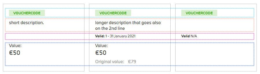 vertically aligned elements inside flexbox
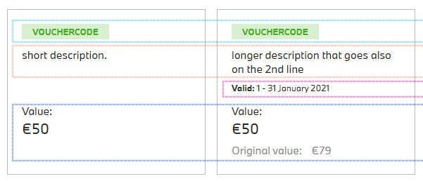
We have 3 boxes that represent vouchers and each of them contain some children elements. For example:
voucher code
description
date
value
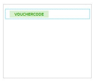
They are highlighted with the dashed lines (the box in the middle shows all information). Let’s create the voucher box first and display its voucher code.
HTML:
<div class="voucher-box">
  <span class="voucher-box__code">'Vouchercode'</span>
</div>
CSS:
.voucher-box {
  **display: flex;
  flex-direction: column;
  align-items: flex-start;
**  padding: 20px;
  min-height: 170px;
  border: 1px solid #bbbbbb;
}

voucher-box__code {
  display: inline-block;
  background-color: #d8efd0;
  color: #3db014;
  font-size: 12px;
  padding: 3px 15px;
  margin-bottom: 12px;
  font-weight: bold;
  text-align: center;
  text-transform: uppercase;
}
Output:
We defined flexbox and it’s flex-direction: column, so all elements will be stacked below one another. Now we are going to add the voucher description and the date:
flex-grow property
HTML:
<div class="voucher-box">
  <span class="voucher-box__code">'Vouchercode'</span>
  **<p class="voucher-box__desc">**longer description that goes also on the 2nd line**</p>
  <p class="voucher-box__date">**1 - 31 January 2021**</p>
**</div>
CSS:
.voucher-box__desc {
  **flex-grow: 1;
**  **max-height: 40px;
**  margin-bottom: 9px;
}

.voucher-box__date {
  font-size: 12px;
  margin-bottom: 15px;
}
Output
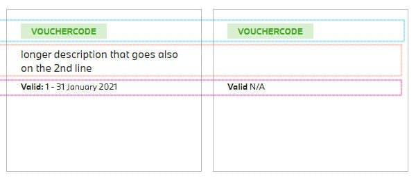
Notice flex-grow property set to 1 on the description element.
With the
flex-growproperty set to a positive integer, flex items can grow along the main axis from theirflex-basis. This will cause the item to stretch and take up any available space on that axis, or a proportion of the available space if other items are allowed to grow too.
On the right side of the image, you can see the description for the paragraph is not available, so it appears empty (paragraph is in the DOM though). At the same time, we display N/A value for the date below. That’s why we set *flex-grow: 1, because we want this paragraph to stretch even though it’s empty. Otherwise the date would appear in its place (orange square). Also we set **max-height* on the paragraph (we consider it should fit onto 2 lines), because without this limitation it would stretch further down.
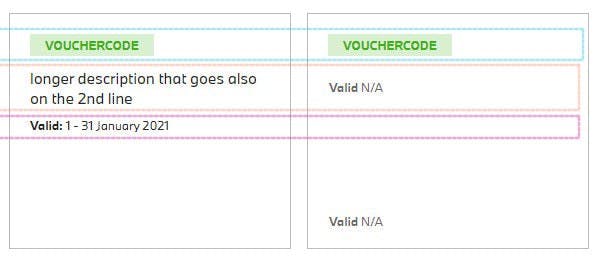 description without flex-grow (orange square) and without max-height (down)
margin-top: auto
Let’s add the value now. We want it to be displayed always at the bottom so when we omit the date it won’t jump up right after description.
HTML:
<div class="voucher-box">
  <span class="voucher-box__code">'Vouchercode'</span>
  <p class="voucher-box__desc">longer description that goes also on the 2nd line</p>
  <p class="voucher-box__date">1 - 31 January 2021</p>
  **<div class="voucher-box__balance">
**    <span>Current balance</span>
    <div class="voucher-box__balance--sum">€50</div>
    <div class="voucher-box__balance--original">Original balance: <span>€70</span>
    </div>
**  </div>
**</div>
CSS:
.voucher-box__balance {
  **margin-top: auto;
  min-height: 80px;**
}
A simple trick is to use margin-top: auto value.
What if we completely omitted the date element in the DOM and we didn’t display the original value? (image below — left side) The Value would be still displayed at the bottom but kind of in the middle of the blue rectangle, so we also set min-height here to align it nicely in that case.
Recap
We learned that we can use margin-top property to align element at the bottom and that flex-grow property stretches the elements based on available space in the flexbox. This could be also useful for example in horizontal menus. Of course there’s much more to the flexbox so I encourage you to check out other flex properties and I hope you try the above in your projects.
Thank you!