


and using power of Sass
In this article I am gonna cover:
Styling HTML elements based on number of their siblings
utilizing @at-root Sass rule
I’ve had a chance to refactor one page component recently. I just wanted to remove some unnecessary HTML classes and rewrite some bits of CSS. There were some elements still floating and it was time for them to flex.
Let’s imagine this scenario. There is a container that can contain from 1 to 4 columns. The columns have to be always centered and in some breakpoints they stack. Flexbox can handle that with ease but there was a tricky part. The width of the columns ought to change based on number of columns. To illustrate what I mean:
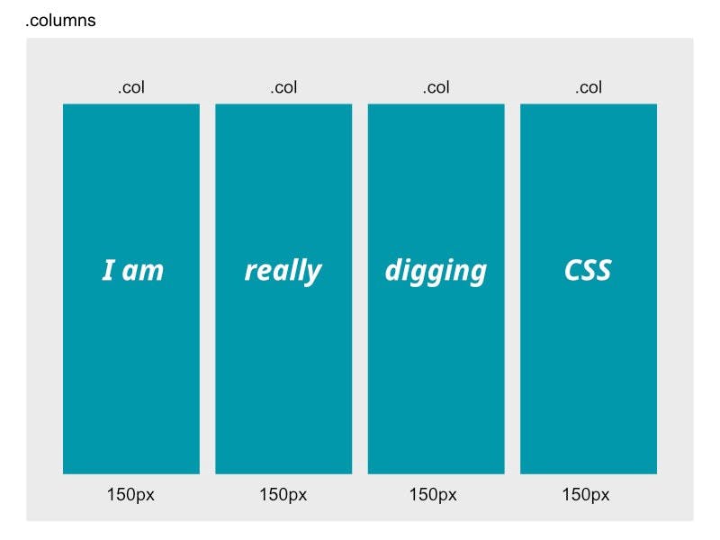
HTML would look like:
<div class="columns">
    <div class="col">I am</div>
    <div class="col">really</div>
    <div class="col">digging</div>
    <div class="col">CSS</div>
</div>
For example if we display only 1 or 2 columns, we want them to be wider than 150px.
 on [Unsplash](https://unsplash.com?utm_source=medium&utm_medium=referral)](https://cdn-images-1.medium.com/max/10598/0*pvkkh5PZqIvEQ7aY) Photo by
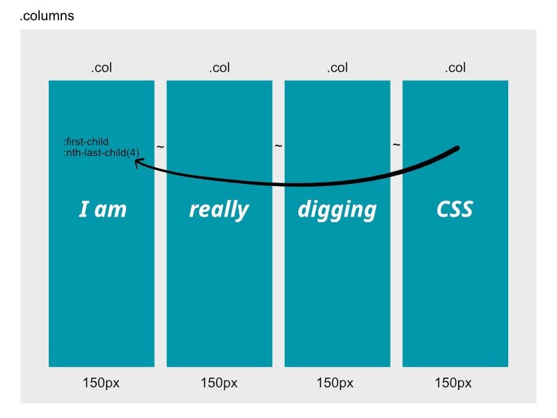
Photo by Someone had to tackle this styling problem before, so I did a search and voilà! I didn’t have to reinvent the wheel. Someone asked: Can CSS detect the number of children an element has? Yes, this is the solution:
/* one item */
li:first-child:nth-last-child(1) {
/* -or- li:only-child { */
    width: 100%;
}

/* two items */
li:first-child:nth-last-child(2),
li:first-child:nth-last-child(2) ~ li {
    width: 50%;
}

/* three items */
li:first-child:nth-last-child(3),
li:first-child:nth-last-child(3) ~ li {
    width: 33.3333%;
}

/* four items */
li:first-child:nth-last-child(4),
li:first-child:nth-last-child(4) ~ li {
    width: 25%;
}
The trick is to select the first child when it’s also the nth-from-the-last child.
The
**:nth-last-child()**CSS pseudo-class matches elements based on their position among a group of siblings, counting from the end.
We can see also ‘~’ symbol is used, which is called general sibling combinator.
The general sibling combinator (
~) separates two selectors and matches all iterations of the second element, that are following the first element (though not necessarily immediately), and are children of the same parent element.
So we sorted out the columns question and kept the html clean. No extra classes needed. Here is a nice demo that show this technique.
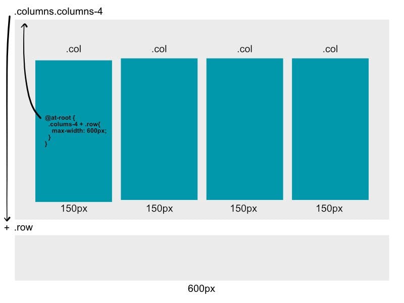
Let’s extend this scenario by inserting a ‘row’ below the columns.
Utilizing @at-root Sass rule
This is what I mean by adding a row to our layout:
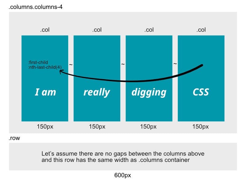
How do we make the row adjust its width to columns? For example if 4 columns make total width of 600px, we want width of the row to be the same. If we display only 2 columns and total width is for example 480px, the row should change its width too.
We can do it by using @at-root Sass rule.
.col {
    /* four items */
    &:first-child:nth-last-child(4),
    &:first-child:nth-last-child(4) ~ & {
        @include breakpoint('from-tablet-landscape') {
            width: 300px;
            **@at-root {
                .columns-4 + .row{
                    max-width: 1290px;
                }
            }**
        }
    }
}
@at-root is one of the At-rules of Sass.
The
**@at-rootrule is usually written@at-root <selector> { ... }and causes everything within it to be emitted at the root of the document instead of using the normal nesting.** It's most often used when doing advanced nesting with the SassScript parent selector and selector functions.
In the output we will get:
.columns-4 + .row{
    max-width: 1290px;
}
We wrote a media query inside a single column (.col), but thanks to @at-root we can jump out of that nesting and target the parent (.columns-4) and its sibling (.row). For targeting the row we use ‘+’ symbol, which is the adjacent sibling combinator.
The adjacent sibling combinator (
+) separates two selectors and matches the second element only if it immediately follows the first element, and both are children of the same parent[element](developer.mozilla.org/en-US/docs/Web/API/El..).
Notice that I added another class .columns-4 to .columns and in the snippet above I reference this more specific class in media query. Unfortunately, if we used only .columns class, the last media query would overwrite previous ones (for instance .columns-3), and the row width would be too wide.
Conclusion
We learned how to style adjacent elements (columns) based on their number using only CSS and then we covered also usage of @at-root Sass rule by creating another element (row) below them. Thanks to media queries and the rules described above we got a nice responsive layout where parent elements keep the same width.
Thank you for reading, sharing and following! It's Miro's fault! Newsletter about web front-end technologiesmiro.substack.com