


Keep up with new CSS features and refresh some old ones
I am going to show you 10 exciting CSS properties. Some of them are marked as experimental on MDN web docs, which means they are just coming to fruition. As they state on their website, a technology is experimental if one or both of these will be true:
It is implemented and enabled by default in less than two modern major browsers.
Its defining spec is likely to change significantly, in backwards-incompatible ways (i.e. it may break existing code that relies on the feature).
If it is experimental, you should consider whether it can be used in production.
1. aspect-ratio
 on [Unsplash](https://unsplash.com?utm_source=medium&utm_medium=referral)](https://cdn-images-1.medium.com/max/11686/0*gk7YFN43BjuSzqpv)
The aspect ratio of an image is the ratio of its width to its height. The very common aspect ratios are:
16:9 (used often for videos)
4:3 (for example photos)
1:1 (square)
To set aspect ratio to an image, we had to calculate a percentage before and apply it to padding-top property. For the 3 ratios above it would look like this:
9 / 16 = 0.5625 => padding-top: 56.25%
3 / 4 = 0.75 => padding-top: 75%
1 / 1 = 1 => padding-top: 100%
There’s a better and direct way to do this now. Instead of padding-top we can use the following:
aspect-ratio: 16 / 9;
aspect-ratio: 4 / 3;
aspect-ratio: 1 / 1;
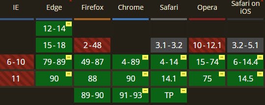
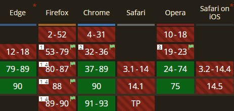
Browser compatibility
Browser compatibility is not so bad. Firefox supports is partially and it can be enabled. Unfortunately Safari lags behind as with many other features.
2. content-visibility and contain-intrinsic-size
 on [Unsplash](https://unsplash.com?utm_source=medium&utm_medium=referral)](https://cdn-images-1.medium.com/max/10000/0*v2yp-LlBXFQBPvfZ)
You might have 2 common CSS properties in mind when you read content and visibility.
display: none
visibility: hidden
They are often used to control visibility of the content. The new content-visibility property is similar, but it provides us with several advantages. The main one is improvement of performance!
The
[content-visibility](drafts.csswg.org/css-contain/#propdef-conte..) property, launching in Chromium 85, might be one of the most impactful new CSS properties for improving page load performance.
It enables the browser to skip rendering work, including layout and painting, until it is needed. That means that off screen content won’t be rendered and we can save several milliseconds on initial load and boost the performance.
How to use it? The easiest way is to use auto as a value, so the browser determines when and how to use it.
.container {
  content-visibility: auto;
  contain-intrinsic-size: 1000px;
}
Notice contain-intrinsic-size property.
In order to realize the potential benefits of
content-visibility, the browser needs to apply size containment to ensure that the rendering results of contents do not affect the size of the element in any way.
We need to set contain-intrinsic size to the element otherwise the browser might think its height is 0, and in that case we won’t gain performance benefit.
To have a better control over showing/hiding elements you could also use content-visibility: hidden. It behaves like display: none, but it preserves the rendering state of the element!
For more details I recommend you to read this article.
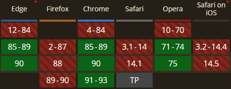
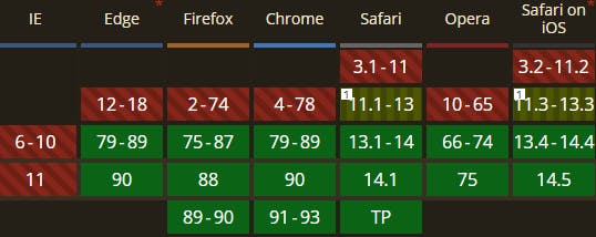
Browser compatibility
It’s similar to aspect-ratio, but here Firefox doesn’t have even a partial support. It doesn’t matter much since this is a feature that won’t break your site if you use it and it’s not supported. It can only help you with performance when applied correctly.
 content-visibility
3. ::marker pseudo element
](https://cdn-images-1.medium.com/max/2912/0*N9yxgH8UuRTyyOTP.jpeg)
::marker works on list items <li> and *<summary> element. Only a few CSS properties can be used in a rule though. You are probably thinking of the color. That’s right, finally we can change the color of the dots and squares and we don’t have to rely on :before* pseudo element. We can use it like this:
::marker{
    color: red; // use some nice hex color here :-)
    font-size: 1.2em;
}
Another supported property is content, so you could use it like this for example:
li::marker {
    content: "😍";
}
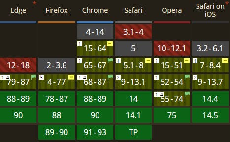
Browser compatibility
Several months ago, only Firefox supported it by default and in Chrome we had to enable the flag first (*Enable experimental Web Platform features preference -> chrome://flags)*
The support is great now. Even if it wasn’t supported by all browsers, users would see the black bullets just as before, which I think is acceptable.
4. background-clip: text
 on [Unsplash](https://unsplash.com?utm_source=medium&utm_medium=referral)](https://cdn-images-1.medium.com/max/10944/0*LMPX1zP5onbpNgOx)
I’ve used clip-path property before, but background-clip? What does it do?
The [**background-clip](https://developer.mozilla.org/en-US/docs/Web/CSS/background-clip)**CSS property sets whether an element's background extends underneath its border box, padding box, or content box. (If you are confused with all those boxes, make sure you understand the basic CSS box model first). The following codepen helps to visualize it:
There is a new background-clip: text property that makes the background clipped to the foreground text. It means we can create for example gradient text effect without using images or SVG. Check out this codepen:
 by [Adam Argyle](https://codepen.io/argyleink)](https://cdn-images-1.medium.com/max/2000/0*XJgAnDc6VApUJINe.png) or this codepen by Adam Argyle
or this codepen by Adam Argyle
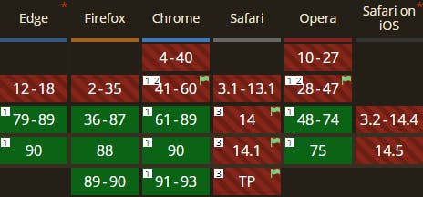
Note: It won’t work if you specify background on HTML element! Also check browser compatibility :
 background-clip: text
5. clamp()
 on [Unsplash](https://unsplash.com?utm_source=medium&utm_medium=referral)](https://cdn-images-1.medium.com/max/10368/0*Fqi98MxqcN_P1Qb-) Photo by
Photo by This feature has been around for some time but it’s pretty new for me. It’s particularly useful for responsive behaviour and you can use it with any properties that accept numbers, percentages, length etc. (for example you can control font-size or image width).
CSS clamp() takes 3 parameters:
minimum value
preferred value
maximum value
It clamps a value between an upper and lower bound. So if we have for example:
.element{
    width: clamp(300px, 50vw, 600px);
}
The element width will try to take 50vw (viewport width) as a preferred value, but it won’t be smaller than 250px and it won’t get wider than 600px. This way we don’t have to deal with min(), max() and calc() CSS properties to calculate proper values, because the clamp() resolves to:
[max](developer.mozilla.org/en-US/docs/Web/CSS/ma.., [min](developer.mozilla.org/en-US/docs/Web/CSS/mi.., MAX)).
Here’s an example for responsive font-size:
You can definitely start using this one as the support is great:
6. :is() and :where() pseudo classes
 on [Unsplash](https://unsplash.com?utm_source=medium&utm_medium=referral)](https://cdn-images-1.medium.com/max/5198/0*HQL6sJrUM-zrIdLK)
Both :is() nad :where() take a selector list as its argument (list of classes, IDs, …). It can look like this:
:is(main, section, article) h2{
    color: #c2c2c2;
}
It’s shorter than writing each rule separately:
main h2,
section h2,
article h2{
    color: #c2c2c2;
}
Yes, these pseudo classes are similar to using preprocessors like SASS, where we could write the following:
main, section, article {
    h2 {color: #c2c2c2;}
}
There is a difference though. They are considered forgiving selectors, which means that if 1 of the selector in the list is not supported or valid for example, the rest will pass.
Apart from that, the main difference between :is() and :where() is specificity.
:where() has specificity 0
: is() takes the specificity of its most specific argument
Consider that when you use selectors that might overwrite other styles.
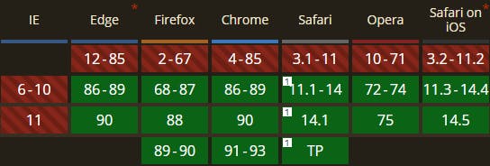
Browser compatibility:
Support is currently good for both pseudo classes.
 :is() compatibility
7. :in-range() and out-of-range()
 on [Unsplash](https://unsplash.com?utm_source=medium&utm_medium=referral)](https://cdn-images-1.medium.com/max/10840/0*lcLWbg413h3eaDd3) Photo by
Photo by Do you know these? Another pair of older properties. I think I’ve never used them before so I decided to add them to the list, even though it’s nothing new.
We can use these pseudo classes for example with the input fields that can take range limitation. Like min and max attributes on input with the type number. (Other valid cases are for date, month, week, time, datetime-localand range)
<input type="number" min="1" max="10" name="number">
Then we could add green border to the input when its value is within the range or red border when it’s out of the range. Well, style it anyway you like.
input:in-range {
  border: 1px solid green;
}

input:out-of-range {
  border: 1px solid red;
}
Here’s a codepen:
We don’t need Javascript to style some inputs which is nice, isn’t it?
8. scroll-behavior : smooth
 on [Unsplash](https://unsplash.com?utm_source=medium&utm_medium=referral)](https://cdn-images-1.medium.com/max/6872/0*0lHndhcAWA1xSVrb)
This property is self-explanatory. A typical use case where we can use it is navigation. Links that reference #ID to sections on the page with that #ID. The default (auto) behaviour is that the page jumps on click. We immediately get to the section we want to see.
Before we had to use Javascript to animate the scroll. Now all we need is one line of CSS:
scroll-behavior : smooth;
Check out this codepen below to see it in action:
Compatibility:
In Safari it has to be enabled under Experimental Features flag — ‘CSSOM View Smooth Scrolling’. Other browsers support it.
9. dialog element and ::backdrop pseudo-element
 on [Unsplash](https://unsplash.com?utm_source=medium&utm_medium=referral)](https://cdn-images-1.medium.com/max/10944/0*BoWrAMzU8lOhKy6o)
A dialog (or modal) is often created with div elements. When it is displayed usually it has some backdrop element (another div) that sets a transparent background for the page while the modal window stands out. It is also common to use other 3rd party code to display and style the modals (for example Bootstrap).
Good news is that several browsers have already implemented native support for the modals. Specifically, the dialog element.
<dialog open>
 <h2>heading in the dialog</h2>
<dialog>
As you can see, also open attribute is supported, which obviously indicates that the dialog is open. Instead of creating extra div, you can style the backdrop using the ::backdrop pseudo element.
dialog::backdrop{
  background: rgba(0, 0, 0, 0.5);
}
How do you open it? There’s Javasript method available:
var dialog = document.getElementById('nativeDialog');
dialog.**showModal();**
Take a look at the following codepen to see the implementation details.
Compatibility
3 browsers fully support it already and in Firefox you can enable it:
Supported in Firefox by enabling
dom.dialog_element.enabledinabout:config
 <dialog> element
10. text-underline-offset
 on [Unsplash](https://unsplash.com?utm_source=medium&utm_medium=referral)](https://cdn-images-1.medium.com/max/12000/0*eNESuPcfUyHjpj53)
I am sure you know text-decoration: underline property. It underlines the text, but it’s not very nice because it’s very close to the text itself.
 example of default text-decoration
We had a few options before to make a gap between the text and the line. The most common are:
using border-bottom with padding
styling :after or :before pseudo element and positioning it absolutely
If we have multiple lines a problem occur with the latter though. No more troubles anymore we just need one additional line:
text-underline-offset: 3px;
That’s it! It looks like this:

text-underline-offset: 3px;
Conclusion
I listed some older and some newer CSS properties that are gaining support of the browsers. The compatibility in general is pretty good. Safari tends to lag behind other browsers as we can see from the compatibility tables. Always check it and consider if you can use it in production.
I hope you learnt something new and would like to hear how many of these you knew/didn’t know. Tell me in the comments, click follow and tell your friends and fellow developers about these cool CSS properties.
Thanks for reading!